
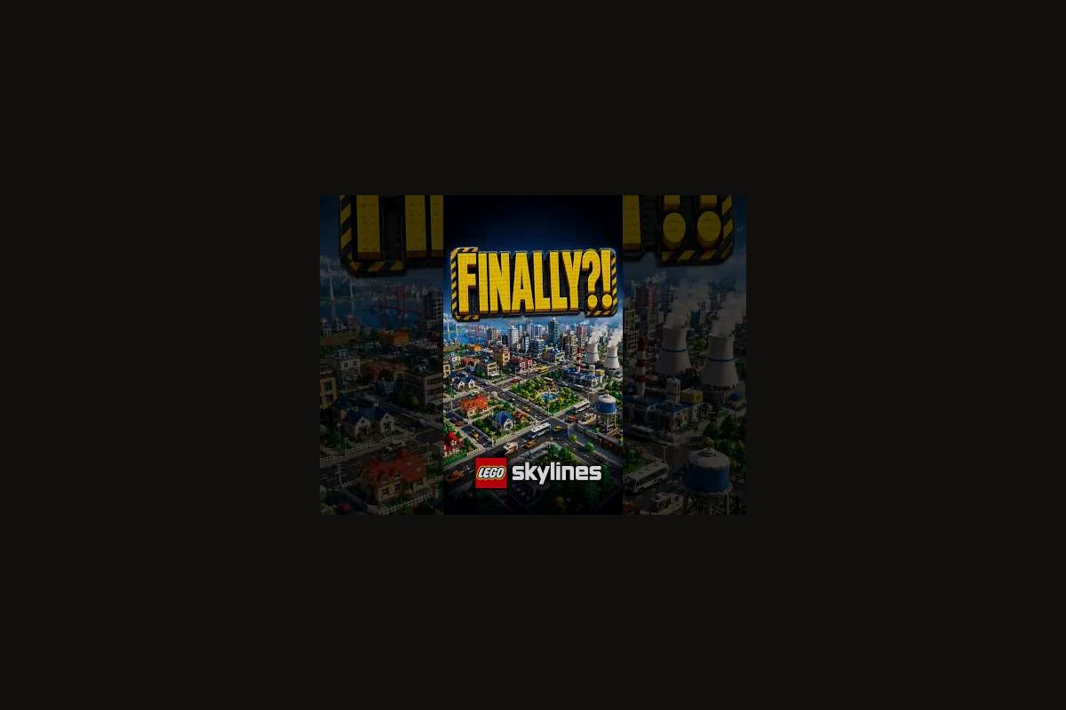
Building a city in LEGO Skylines is one thing; turning that city into a memorable showcase is another. According to the LEGO Skylines on Steam listing, the game ships with a large catalogue of buildings, decorations, and customization options designed for personalizing districts, and that catalogue is the raw material every showcase builder learns to bend. This guide focuses on LEGO Skylines district aesthetics as a craft, not a checkbox, so your creative city reads as a deliberate piece of urban design rather than a flat grid of cute props. Whether you care about screenshot-ready skylines, storybook neighborhoods, or simply a city that feels good to fly over, the principles below will sharpen your decorative layout and turn routine LEGO builds into something worth sharing.
The Core Pillars of LEGO Skylines District Aesthetics
Before chasing specific props or color schemes, it helps to know the five pillars that experienced showcase builders keep coming back to. Each pillar shapes how players read a district from a screenshot, a flyover, or a thumbnail, and skipping any one of them usually shows in the final result. If you are still mapping out the basics of placement and footprint, the LEGO Skylines building guide pairs well with this one and covers the mechanical side of getting a building on the map in the first place.
Scale, Color, Silhouette, Texture, and Story
| Pillar | What it controls | Common mistake | Quick fix |
|---|---|---|---|
| Scale | How tall or wide buildings feel relative to streets | Mixing small shop props next to skyscrapers | Group props by the same height band per block |
| Color | The emotional read of the district (cozy, industrial, pastel) | Using every LEGO color in one block | Pick a 3-color palette plus one accent |
| Silhouette | The outline of the skyline against the horizon | Flat, single-height rooflines | Stagger roof pieces and add tower accents |
| Texture | Visual density of brick, plate, and slope patterns | Empty plazas between buildings | Add ground tiles, planters, and baseplates |
| Story | The implied narrative (harbor, market, arcade) | Generic grid of houses | Name the district and design around that theme |
Mastering these five pillars is what separates a competent city from a true LEGO Skylines city showcase. Scale stops your district from looking like a child's toy box; color gives it mood; silhouette gives it a recognizable shape; texture keeps the eye moving; and story is the reason a viewer lingers on a screenshot for ten seconds instead of one. Once you internalize this framework, every new prop you unlock becomes a tool for one of the five jobs, and your building optimization decisions start to feel intentional rather than reactive.
Why These Pillars Matter for Creative Cities
Pillars matter because LEGO Skylines is a cozy city-builder, and cozy games reward cohesion over spectacle. Players on community threads consistently point out that the most-photographed districts in early showcase reels are rarely the biggest; they are the ones where every prop pulls its weight in at least one of the five categories. When you review your own save, scan each block and ask which pillar each prop is serving. If a tree is not contributing color, silhouette, texture, or story, it is probably visual noise that dilutes your decorative layout. This habit alone will tighten your LEGO Skylines decorative layout far faster than chasing rare pieces, and it sets you up to apply the same logic when you graduate to larger creative city projects.
Mining the Building Catalogue for District Aesthetic Value
The Steam page describes a large catalogue of buildings, decorations, parks, donut shops, and workplaces, and the official LEGO Skylines page on Paradox Interactive adds homes, jobs, and parks to the mix. That catalogue is your palette, and reading it well is half of building optimization. Most players scroll the build menu and pick by category; showcase builders scroll by silhouette and color family first, then check the function. The same shop that looks bland in a generic grid can become the anchor of a pink-roofed market row if you understand which prop speaks which visual language.
Decoration Categories and Their Aesthetic Roles
| Category | Primary pillar served | Best district roles | Pair well with |
|---|---|---|---|
| Trees & foliage | Color, texture, silhouette | Residential, parks, harbor edges | Ground tiles, benches, lamp posts |
| Plaza props (fountains, statues) | Silhouette, story | Civic centers, market squares | Wide avenues, symmetrical blocks |
| Street furniture | Texture, color | Every district, but essential in commercial | Trees, ground tiles, road markings |
| Roof and tower accents | Silhouette | Skyline backdrops, dense commercial | Tall workplaces, mixed-use blocks |
| Ground tiles & baseplates | Texture, color | Every district, especially plazas | Roads, building footprints |
| Themed signage | Story, color | Donut rows, harbor docks, arcade streets | Coordinated roof colors, lamp posts |
Treating the catalogue as a set of aesthetic roles rather than a list of unlockable objects unlocks faster, more confident choices. A fountain in the wrong place is a wasted prop; a fountain anchoring a symmetrical plaza is doing the work of three pillars at once. This is the mindset that powers a real LEGO Skylines architecture guide, because architecture is fundamentally about which piece carries which visual load.
The Building Optimization Mindset
Optimization in a cozy LEGO city is not about minimum cost or maximum population; it is about maximum aesthetic return per prop placed. Two showcase builders with the same unlocks can produce wildly different districts because one thinks in props and the other thinks in visual roles. When you place a building, ask: which pillar is this serving, what is the silhouette it adds, and what color is it contributing to the block? If you cannot answer those three questions in five seconds, you are probably placing the prop out of habit rather than design, and that habit is the first thing to break on the path to a stronger creative city.
Decorative Layout Patterns That Hold Up in Any Showcase
Once the catalogue feels familiar, the next skill is composing props and buildings into repeatable patterns. Patterns are useful because they give you a default answer when you are stuck, and they make your district readable from any angle. A residential block built on the same template, repeated with small variations, looks more cohesive than seven custom-designed houses, and that cohesion is what earns the screenshot the "screenshot of the week" tag in showcase communities.
Five Layout Templates Worth Memorizing
| Pattern | Best for | Key moves | Pitfall to avoid |
|---|---|---|---|
| Symmetric plaza | Civic centers, market squares | Mirror props on either side of a central statue or fountain | Forgetting the center anchor; the symmetry collapses |
| Layered waterfront | Harbor, river, lake edges | Tall silhouettes in back, mid props in middle, low textures in front | Blocking the water view with a wall of trees |
| Color-banded avenue | Commercial strips, main streets | One color per block face, accent on signage | Mixing more than three colors per block face |
| Courtyard cluster | Residential, mixed-use | Buildings frame an interior garden or playground | Leaving the courtyard too small to read as a space |
| Tower-and-lowrise mix | Skyline backdrops, downtown | One tall prop per cluster surrounded by lower roofs | Repeating the tall prop too often; it loses hierarchy |
These five patterns cover the majority of strong community showcase builds that have surfaced so far. Players who internalize them spend less time deleting half-built blocks and more time iterating, because every prop has a job the moment it is placed. A practical tip from experienced builders: pick one pattern per district and resist the urge to combine two in the same block, because mixed-pattern blocks are the fastest path to a muddy decorative layout.
Scaling Patterns Across the Whole City
Patterns work best when they are scaled to district size, not applied uniformly everywhere. A symmetric plaza in a small civic block feels grand; the same plaza dropped into a sprawling downtown feels lost. According to the official LEGO Skylines page, parks and donut shops are highlighted as part of the catalogue, which means the game is explicitly inviting thematic clusters, not a uniform grid. Use the largest pattern only in one or two showcase districts per creative city, and let the rest of the city use smaller variations. That hierarchy is what gives a city its sense of place, and it is the difference between a city and a settlement in the eyes of a viewer.
Color, Silhouette, and Skyline Composition
Color and silhouette are the two pillars that show up the most in showcase screenshots, because they are the first things a viewer reads before any prop detail registers. Getting them right is mostly a matter of restraint and repetition: pick a small palette, repeat it, and let one accent color do the loud talking. For a stronger foundation in how buildings and decorations are placed in the first place, the LEGO Skylines growth guide is a useful companion because growth decisions early on tend to lock in your color story later.
Building a District Palette in Three Colors Plus an Accent
| Slot | Role | Example palette (cozy harbor) | Example palette (industrial) |
|---|---|---|---|
| Base color | 60% of the district | Warm white | Slate gray |
| Secondary color | 30% of the district | Sand yellow | Rust orange |
| Accent | 10% of the district | Coral red | Signal blue |
| Roof color | Ties the block together | Terracotta | Dark gray |
A four-color rule is what keeps a creative city from looking like a parts explosion. Players who skip this step and place props straight from the catalogue usually end up with a district that photographs well in isolation but clashes with neighboring blocks; the fix is to pre-commit a palette per district and refuse any prop that breaks it. This is also where LEGO Skylines building optimization becomes a daily habit rather than a one-time project, because every new building you place is a palette test as much as a function test.
Silhouette Tricks That Make Skylines Read From Far Away
Silhouette is what the city looks like as a black outline against the sky, and it is the single biggest factor in whether your LEGO Skylines city showcase image gets clicked. Community builders consistently use four silhouette tricks: stagger roof heights, plant a single tall landmark per district, frame the skyline with trees on the edges, and avoid placing two of the same tall prop within one block. Each trick contributes hierarchy, which is the visual cue your brain uses to decide whether a city is interesting or monotonous. If your current skyline reads as a flat line from the standard camera angle, the fix is almost always a height pass, not a recolor, and that is good news because height passes are faster than full rebuilds.
Putting It All Together: A District Aesthetics Workflow
Knowing the principles is one thing; applying them under a time budget is another. Below is a workflow that experienced showcase builders report using when they are trying to level up a district from "fine" to "screenshot-worthy." It assumes you already have a functioning city and want to push it toward a stronger decorative layout, which is the most common situation for returning players.
Step-by-Step Pass for a Showcase-Ready District
| Step | Action | Time budget | Output |
|---|---|---|---|
| 1 | Pick one district and name its story (harbor, market, arcade) | 5 min | A one-line theme statement |
| 2 | Commit a 4-color palette and write it down | 5 min | A color list you can refer to while placing |
| 3 | Audit current props against the five pillars | 15 min | A short list of props that earn their keep |
| 4 | Remove or relocate any prop that fails the audit | 20 min | A cleaner base for the next pass |
| 5 | Apply one layout template from the pattern list | 30 min | A coherent block structure |
| 6 | Run a height pass to fix silhouette | 15 min | A staggered skyline |
| 7 | Add one landmark per district | 10 min | A visual anchor for screenshots |
| 8 | Screenshot, review, repeat for the next district | 10 min | A repeatable loop |
This loop is intentionally short because showcase building is an iterative hobby, not a sprint. Each pass sharpens the city by a small but visible amount, and the cumulative effect over a few sessions is a creative city that looks like it was designed rather than assembled. According to community showcase threads, the most common reason players abandon a city is that they try to perfect one district in a single sitting; the workflow above sidesteps that trap by capping each session at roughly two hours and promising visible progress in every session.
Common Aesthetic Mistakes and How to Recover
| Mistake | Why it hurts the district | Recovery move |
|---|---|---|
| Filling every empty tile with a tree | Texture turns into mush; the eye has nowhere to rest | Remove 30% of foliage and add a plaza or path |
| Using the same building rotation everywhere | Silhouette flattens; blocks blend together | Rotate one in every four buildings 90 degrees |
| Mixing too many roof colors | Color story becomes noise | Repaint or relocate roofs to match the district palette |
| Ignoring ground tiles | Plaza props float visually | Lay baseplates under any prop that reads as "floating" |
| Skipping landmarks | No anchor point for screenshots | Add one tall or unique prop per district |
Each of these mistakes is recoverable, which is good news because every showcase builder has shipped at least one of them in their first city. The trick is to recognize them on a screenshot pass rather than during placement, because distance from the city gives you better aesthetic judgment than flyover mode ever will. Reviewing your own work from a camera angle you did not build toward is the single fastest way to train your eye for LEGO Skylines architecture guide-level decisions.
Frequently Asked Questions
What is the most important factor in LEGO Skylines district aesthetics?
Cohesion matters more than any single prop in a LEGO Skylines district. A block that repeats three colors, one silhouette pattern, and one layout template from the decorations catalogue reads as intentional city design, while rare pieces fighting each other look cluttered. Lock color and silhouette first, then layer distinctive props.
How do I start a LEGO Skylines city showcase from a blank map?
Pick one district and commit to a four-color palette plus a single layout template — symmetric plaza or layered waterfront — before unlocking the rest of the map. Reading the building catalogue and applying one decorative pattern from the showcase section first prevents the sprawl-then-demolish trap and gives you a clonable template for neighboring districts.
Does building optimization in LEGO Skylines help with aesthetics?
Yes, optimization in LEGO Skylines directly improves aesthetics when you treat it as visual pruning rather than cost-cutting. Audit placed decorations against the five core pillars (scale, color, silhouette, texture, story) from the catalogue reading section, and remove any prop that fails to earn its footprint.
Can I mix multiple layout patterns in one creative city?
Mixing multiple layout patterns works in LEGO Skylines as long as each pattern stays confined to its own district — one symmetric plaza next to a waterfront block next to a tower-and-lowrise zone reads as a varied showcase, but applying different patterns block-by-block makes the city look chaotic. Use roads, parks, or services as natural district boundaries.
Where can I see official examples of LEGO Skylines LEGO builds?
Official LEGO Skylines footage currently comes from the Announcement Trailer on the official YouTube channel, the Steam store page (app 1573550), and the Paradox Interactive game page. Since the game is still "Coming soon," community showcase reels on social platforms are your best supplementary reference for the building catalogue and decoration patterns.